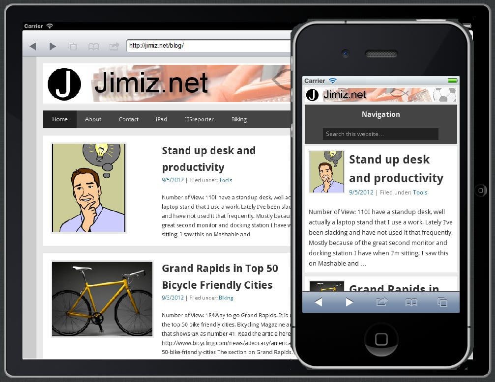
 I’ve got a lot of email lately and also people asking about responsive design. They are interested in what it is and why anyone would do it. The typical conversation revolves around the definition that response design allows you to target any type of display size (mobile, tablet, desktop ,etc). Once people hear that, they instantly go to one of two responses. The first is of pure interest because they want their site to be mobile, or the second is defensive where they have just updated their site to be mobile friendly.
I can understand both reactions. The third reaction similar to what I had was based on pure curiosity. I have been a user of twitterbootstrap that aproaches responsive design as a framework with Grids. However, this is more of a framework that let’s you apply a responsive design. A resent article that I have read (and re-read) is based on mobile first design.
Give this article a read to see how mobile first and responsive design can be incorporated into wordpress
http://wp.smashingmagazine.com/2012/06/28/create-responsive-mobile-first-wordpress-theme/
I have mentioned that this blog is now responsive and can be viewed on many displays. One of which is TV. We are in a time where mobile (tablets and smartphones) are now becoming a larger percentage of web browsers. However, let’s not forget TV. A responsive site will allow for any display TV included to have an adaptive view.
I have used screenfly and Keynote Mite to view sites I have developed on many different screen sizes.
Overall a responsive site allows for more adaptive viewing on any device. It is not always a better experience, however it is very consistent. I like the quote from smashingmagazine that responsive design is a mindset not just a web only tool

