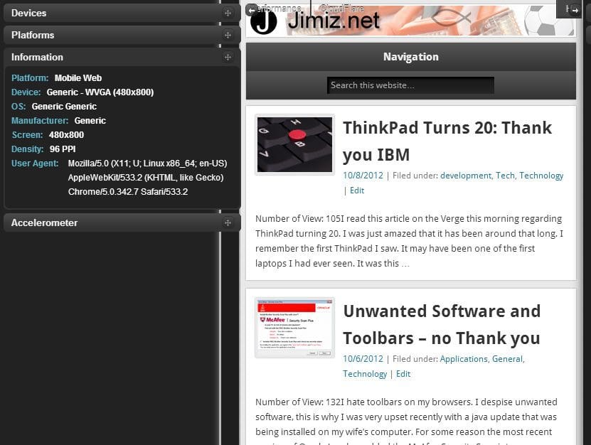
 I have been doing more mobile web sites recently. My preference has been to use responsive design that allows for any display size. The display size can range from Desktop, TV, tablet or phone. However, I have found it is important to know your target audience and also do testing. Not all browsers are understanding of the @media and HTML5 components.
I have found a few testing tools that I continue to use:
- Keynote
- Ripple (chrome plugin)
- Electric Plum – Simulator – You can get a free version through webmatrix
- iPadPeak – An online tool
I typically use a combination of these tools to make sure that the mobile site will function and look correctly on multiple devices. Developing mobile first, is a great method to make sure that you are allowing your site to load properly on a mobile device. Whether it’s jquerymobile or a responsive site, you have to be performance minded in your development.
My next post I will run through the tools I use for performance testing

